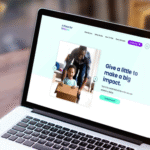
Landing Pages That Convert: From Clicks to Customers
- programmernik
- 0 Comments
You have just a few seconds to make an impression online. According to a study by Nielsen Norman Group, users typically leave a web page within 10–20 seconds unless they find a clear value proposition. This makes your landing page more than just a visual—it’s a critical conversion tool.
But what exactly separates a landing page that converts from one that doesn’t? It’s not just design or copy—it’s a blend of clarity, trust, and user intent. In this article, we’ll break down the core elements of high-converting landing pages, backed by real-world case studies and practical insights.
1. Clear, Benefit-Focused Headlines
Your headline is the first thing visitors see—and it often decides whether they stay or bounce. The best-converting landing pages use headlines that immediately answer the question: “What’s in it for me?”
Example:
Basecamp increased conversions by 14% by simply rewriting its headline to focus on how it helps teams manage projects more efficiently. The original headline talked about features; the new one talked about outcomes.
2. Minimal Distractions, Maximum Focus
Every element on a landing page should guide visitors toward one goal—whether it’s signing up, making a purchase, or booking a demo. Pages cluttered with too many links, menus, or offers tend to confuse rather than convert.
Example:
Wistia simplified its landing page by removing the navigation bar. The result? A 30% lift in signups.
3. Trust Signals that Build Confidence
Conversion rarely happens without trust. Social proof—like testimonials, client logos, case studies, or even security badges—can dramatically improve trustworthiness.
Example:
A/B testing platform VWO added customer logos and a testimonial near the CTA. The conversion rate increased by 11%.
Use authentic proof, not generic stock quotes. A real quote from a real customer always outperforms a generic endorsement.
4. Compelling CTAs that Guide, Not Push
A strong call-to-action (CTA) is not just about the words—it’s about timing, clarity, and placement. Instead of generic CTAs like "Submit" or "Learn More," use action-driven language tied to a benefit.
5. Fast Loading Time and Mobile Responsiveness
A one-second delay in page load can reduce conversions by 7% (source: Akamai). And with more than 60% of web traffic coming from mobile, your landing page must be fast and responsive.
Real-World Success Story: Airbnb’s Host Sign-Up Page
Airbnb’s landing page for potential hosts is a textbook example of conversion-centric design. It dynamically shows how much a host could earn based on their location—a personalized hook that’s proven to work. Clear visuals, localized data, and no distractions make it seamless for users to take action.
Final Thoughts: Conversion Is a Science
High-performing landing pages aren't a result of luck-they're built on proven frameworks. When you focus on clarity, trust, performance, and user intent, conversions follow naturally.
If your current page isn't delivering results, it's probably not the traffic-it's the experience.
Want landing pages that convert? Let's build one together. Book a free strategy call.
Related Posts

- programmernik
- May 13, 2025
Social Media vs Website: What’s Best for Your Business in 2025?
Wondering whether a website is really necessary in the age of Instagram? Here’s a simple comp ..

- programmernik
- May 14, 2025
Website Maintenance Strategies Without Full-Time Help
Discover what makes a landing page truly effective. From headlines to CTA buttons, learn how to ..

- programmernik
- May 8, 2025
Why Online Presence Is Crucial for Business Success
Starting a website for your business? That’s a great move. But one common question every busi ..

